MagicSurvey
My Role
Lead UX designer
Timeline & Status
6 weeks
Shipped in Q3 2024.
Team
1 product manager
1 designer (me)
2 software engineers
Tools
Figma, ProtoPie
Skills
Interaction design
Visual design
Design systems
Rapid prototyping
Usability testing
Handoff
growth in the monthly retention rate
increase in task success rate
improvement of the monthly churn rate
Before
After
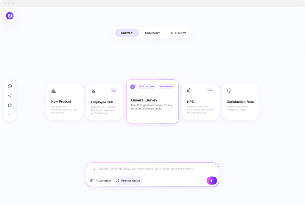
MagicSurvey is internal AI-Native Product for ByteDance's employees. With over 40K+ users, it uses text-based AI prompt to generate survey questionnaires, summaries, and interview outlines.

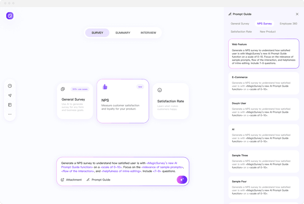
An extensive AI prompt input library, guiding users to write more accurate prompt based on different use cases.
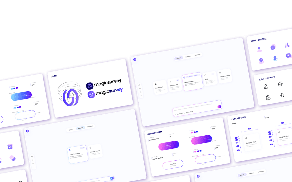
Creating a consistent visual identity and interaction modes for the product's Design System, identify new color systems and introducing new icons.


MagicSurvey's H1 2023 data shows the product suffers in low user retention rate and low task success rate, with significant user drop out at its homepage.
Low Retention Rate
-50%
More than 50% of the users dropped off after landing at the home papge.
Low Task Success Rate
-63%
More than 63% of the generated content were not exported.
What isn't working for the current homepage?
Complicated task completion process with low discoverability for the more useful buttons.
Inconsistent of prompt input format and information architecture lead to user confusion.
Users struggle with writing accurate AI prompts.
After evaluating the existing problems, I worked closely with the product managers to align our design goals, solving user pain points while aligning the product's long-term goal in becoming an AI tool that is intuitive, clear and delightful to use.

Optimize user flow, allowing users to clearly navigate core functions, easily understand and choose templates based on different use case.

Create an AI prompt input library, providing users with prompt examples for each template type.

Creating consistent visual identity and interaction modes for the product's Design System.
Optimize user flow, allowing users to clearly navigate core functions, easily understand and choose templates based on different use case.
Restructure the information architecture to highlight the discoverability of template cards, allowing users to quickly discover and choose.
Old information architecture
New information architecture
Simplifying task completion process from 5 steps to 3 steps.
Visualizing new information architecture and user flow through design iteration.
Option 1
Option 2
Option 3
Option 4
Option 5
Option 6
Create an AI prompt input library, providing users with prompt examples for each template type.
Tailoring the AI prompt input library component to our researchers' need, validating design through testing.

default

activate prompt library
Through usability testing with 9 users, I evaluated the pros and cons of each option, fine tuning the interactions based on our users' feedback.
Creating consistent visual identity and interaction modes for the product's Design System.
Establish visual hierarchy based on functions and different usage sceneriors.
Default state
With AI prompt library
Creating brand new color system and defining different usage sceneriors.
Establishing reusable components for the product design system, including template card, prompt input bar and 10+ new UI icons.
Proactiveness lead to opportunities.
This project did not start with a Product Requirement Document (PRD), instead it was initiated by me after researching the product's H1 2024 report and user feedback pool. I approached the insight and the solution of a homepage redesign to the product team, therefore, the initial phase of this project was largely driven by my proactiveness: pitching to the product manager, learning more about the machine learning engineers, consulting other ux designers, looking across the competitive landscape etc.
Approach design with a system mindset.
Designing with a system mindset is crucial for the product growth. By defining a consistent product design system with components and patterns not only provide a user-centered approach, but also saves time in the long-term product growth. It lets me focus on solving new challenges instead of reinventing the wheel, helping me iterate faster and deliver a smoother user experience
Critical feedback is a gift.
I’ve found that critical feedback is one of the most valuable tools for improvement. It helps me uncover blind spots, challenge assumptions, and see things from perspectives I might have missed. Instead of taking it personally, I try to view feedback as a chance to refine my work and create a better experience for users. Every suggestion, even the tough ones, gives me an opportunity to iterate, grow, and ultimately design something more impactful.


